Bliv gratis medlem

|
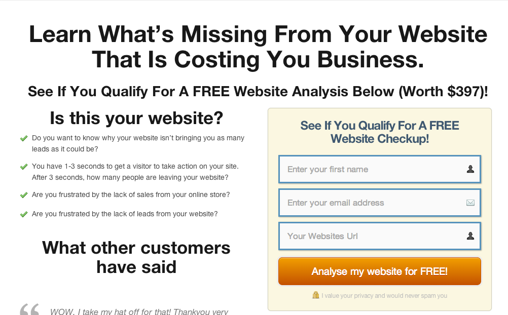
Hi guys, could I get some feedback on this? http://phillip-dyhr-hobbs.com/website-checkup/
|

Hey Phillip
I never know whether to do it in English or Danish with you :)
I think there are a bit too many font sizes which makes it a bit difficult to determine what is most important, e.g. the first three sentences have three different sizes.
The layout works fine as a two column set up to start with which works fine but after the "See the details" it gets a bit unbalanced. It seems like the images and captions don't quite match up.
I also think that amend "See the details" as I first expected a link taking me to the details. Maybe "See the details below" or "Now for the details"... and maybe not use the word details, as you've just used them in the right hand section above.
You could maybe also make a more visual distinction between the sections, so "See the details" section has a different background or horisontal lines marking the section borders.
If you want to place the sign up box, as a reminder/call to action in the details section, then I think you should move it up a bit. Placing it that far down makes the Social Media item seem like it doesn't belong and some might not even scroll all the way down. Maybe it should be placed in one of the columns instead of centred.
I would also resize the font or change the sentence so "said" is not on its own by "What other customers have said"
Otherwise seems like a good deal and something people would use. Free definitely beats $397 :)