Bliv gratis medlem

|
Hej Fellow Aminoer, Can you please give me your thoughts on the new design before I code it up?
|
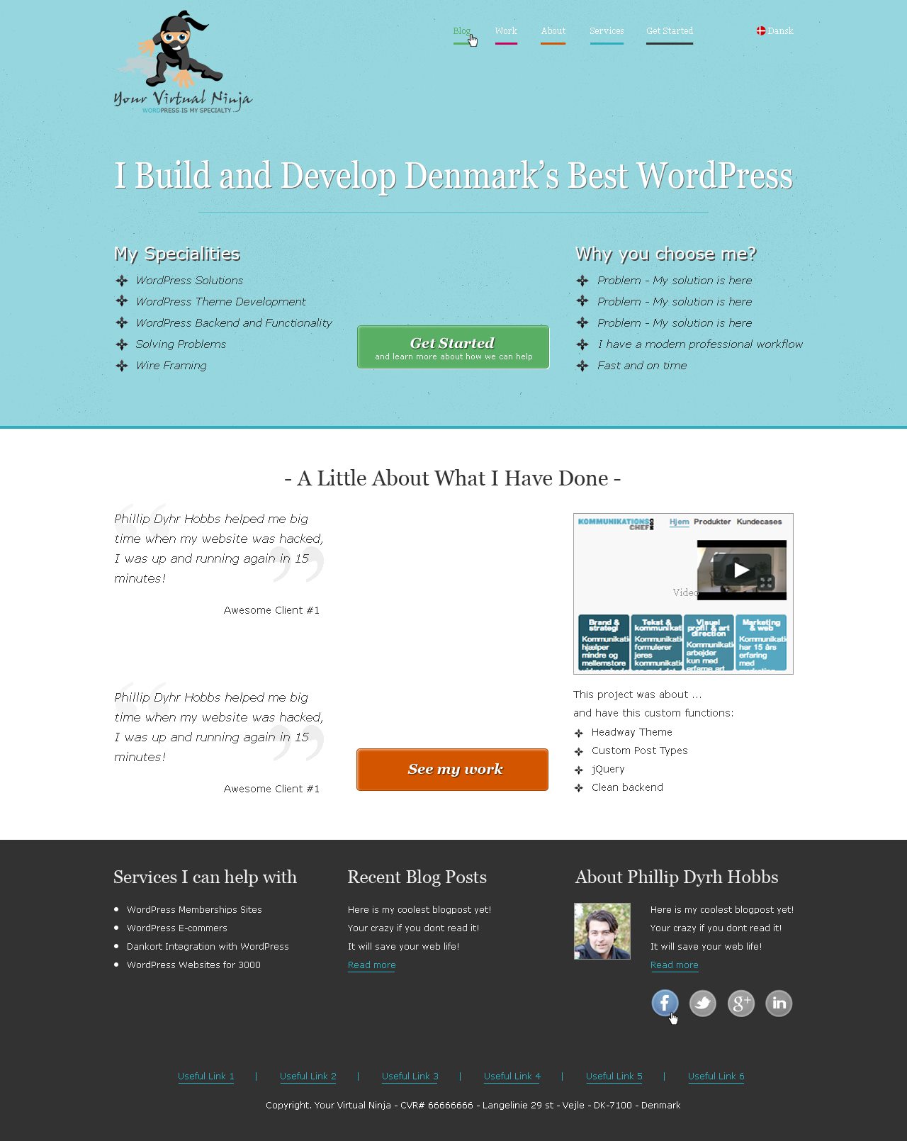

vis sider et mørk sted svært at læse hvad der står da farve valg baggrund og tekst farven er tæt på hinanden
|
Hej Fellow Aminoer, Can you please give me your thoughts on the new design before I code it up?
|
|
vis sider et mørk sted svært at læse hvad der står da farve valg baggrund og tekst farven er tæt på hinanden |
Thanks Mikael |
|
Well Phllip I can just say I love it damn its nice :-) I especially like the awesome client#1 thingie so if any of your clients wishes to remain anonymous then you should use that :-) And I would give the look and feel of the website a perfect 8 outta 10 stars :-) |
Thankyou for the kind words :) |
|
Looking good but I would chose to not have the emphasize on so much text. It gets really annoying to read very fast. It's one thing to have it your citations from customers but I think you should consider removing it from your lists. I would also consider making the menu bigger and maybe in a sans-serif instead of serif font. Another small detail might be your logo. The word "word" in Wordpress is very low contrast compared to background. Can be really hard to read on different screens and in different light settings. Else keep up the good work. -Thomas |
Responsive Design, HTML5, CSS3, jQuery, Wordpress, PHP, MySQL, User Experience, Usability & User Research.
Spm? Skriv.