 We continue our rotating Startupbootcamp
blog series - our ten teams take turns sharing their thoughts and
experiences on their Startupbootcamp adventure. This entry is by
Artas Bartas, of Spockly.
Business Intelligence
There was a point in my life when I was working for a corporation, selling business intelligence solutions to top management. Now, business intelligence (or as we called it BI), is this smart system that collects data from various systems in an enterprise and then visualizes it in a nice dashboard. Is money coming in? You will see charts and graphs in a soothing green color. Bleed money like Paris Hilton on her Saturday shopping spree? Then the entire thing will be blinking in an alarming red. That’s the essence of BI.
Avoiding the Software Graveyard
One thing I remember from those times was that we worked with Microsoft technologies and you know how usability is in corporate Microsoft products. My face would turn blue arguing the advantages of doing BI on that beast of a machine called Microsoft PerformancePoint Server, but every time a competitor like Microstrategy or Cognos would whip out a screenshot of their product my heart would sink just a little bit, because their products made even bad news look good on the screen.
Some of you will argue that it is actual numbers – not presentation – that counts, but having witnessed a few software graveyards first hand, I can tell you that digital tools have to be easy to use and pleasant to look at to gain traction among users. With this lesson in mind, I decided to go and find the best looking data dashboard available on the web. I figured that since we are living through a period of data explosion, there have to be some good dashboards out there. And since old fashioned software is moving “into the cloud,” those dashboards must be available online.
Seth Godins on Steroids?
Well, my assumptions turned out to be at least partially correct: when it comes to social media, analytics services are a dime a dozen. You would think that hot shot startups realize this fact and are busy throwing tons of money to develop usable interfaces and differentiate themselves from competition. And you would be wrong, my friend. Me-too-analytics services all brag about their features and capabilities, but only few will show screenshots of their product without making you fill out a lengthy registration form. The few companies that do show a working demo upfront stand out as marketing super geniuses. Seth Godins on steroids, no less.
So with this background in mind, here is our very own, highly biased and subjective run down of the web’s greatest dashboards.
Market players
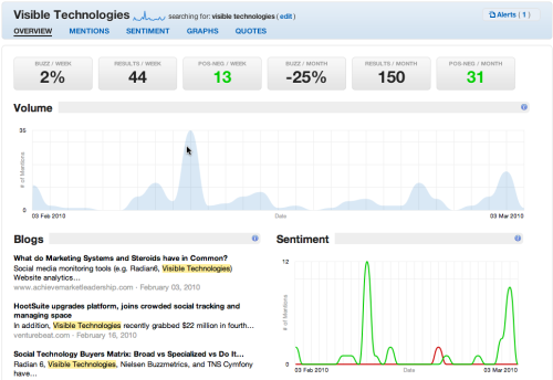
Scout Labs. One of the myriad social “listening” platforms, but it actually manages to differentiate itself visually. Scout Labs (SL) helps brands to track users' reactions to their brand in social media. Although there is a lot of stuff going on in SL dashboards – from popular photos, videos to sentiment metrics, search terms – the company does a relatively good job of presenting all this information in a sparing and visually beautiful way.

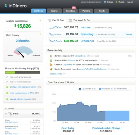
InDinero. YCombinator startup generating rave reviews recently closed a $1.2 million seed round from a coterie of famous angel investors. The company helps small business owners monitor financial health by providing real time overview of companies' accounts. Although critics like to point out similarities to Mint’s user interface, InDinero does a great job of visualizing key financial metrics and turning dry numbers into easy to process charts and indicators.

ChartBeat. Another hot startup that just secured $3 million investment in A round. Chartbeat delivers real-time analytics services to websites and counts Fast Company, Groupon, New York Times, the Onion, Gawker, and Gizmodo among its customers. Their demo page is truly impressive: it manages to communicate a lot of information at once without overwhelming a user. You should also see how smoothly ChartBeat manages live updates, though bear in mind that it can get addictive.

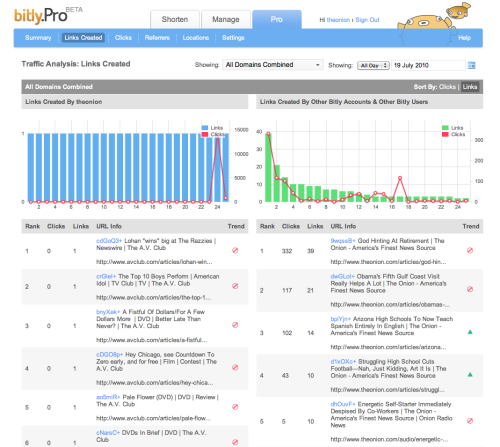
Bit.ly Pro. Called by many skeptics one-trick pony, Bit.ly URL shortening service managed to reinvent itself with an analytics service highlighting trending links, publisher metrics and user attributes. Recently unveiled an analytics dashboards for professionals and enterprises and more metrics plus introduced new visual elements - all of which are skillfully designed to blend in with the rest of the website. Dashboard layout and color palette also make it highly readable and easy to scan. Makes you wonder if usable design is responsible for making Bit.ly 76th most visited site on the web.

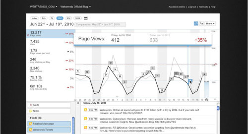
Webtrends. All purpose analytics company that just a month ago acquired Transpond, the platform for churning out standard Facebook apps. Webtrends takes its business – including UX design – seriously: it's dashboards are short on color but long on substance. Thanks to company's long standing interest in social media (and some timely acquisitions), customers can analyze their mobile and Facebook marketing efforts via Webtrends’ classical dashboard. And in case you wondered, the company’s UX efforts are headed by Justin Garrity.


 Bliv gratis medlem

